The Hottest Tube Line: Modelling Tube Temperatures in R
Now, I’m the kind of big tube fanatic who has completed the “Can you name all the stations on the London Underground?” sporcle quiz more times than I can count. But even I have to acknowledge one major drawback of the london tube: it can get really hot down there!
I’ve long suspected the Central line of being the biggest offender in this department, putting it near the bottom in my ranking of favourite tube lines. (The best line, in case you’re wondering, is of course, the Victoria line - as recently evidenced by Geoff Marshall’s twitter poll.)
But, I’d been lacking hard data to support my theory.
Thankfully, I discovered recently that TfL have released a dataset of average monthly temparatures across each tube line, giving me the opportunity to do some fun tube-related analyses and attempt to make some cool TfL themed graphs. You can download the data yourself here.
A few things to note about this data:
- The data runs from 2013-2018. The data don’t end cleanly on the same month for each tube line.
- Tube temperatures appear to be measured daily, at the same time each day, then averaged across each month. The dataset only gives us the month-by-month breakdown.
- The temperatures are measured at platform level. I’m not sure if temperatures are taken at every station and then averaged or not.
- The District, Circle, Hammersmith & City, and Metropolitan lines are grouped together into “sub-surface lines”.
With that, time to look at the data.
Visualisation
I started by making some line plots with a playful TfL theme.
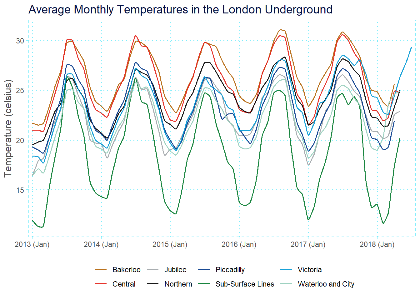
The line plot is imo a little messy, but it does already draw out some interesting features. For instance, the hottest line is actually the Bakerloo, followed closely by the Central line. On the other hand, the sub-surface lines are the coldest lines, which isn’t super surprising.
There’s also clear periodicity in the data driven by seasonal changes; the temperatures rise sharply during the summer and fall again over the winter. Interestingly, the sub-surface lines seem more susceptible to changes in season than other lines.
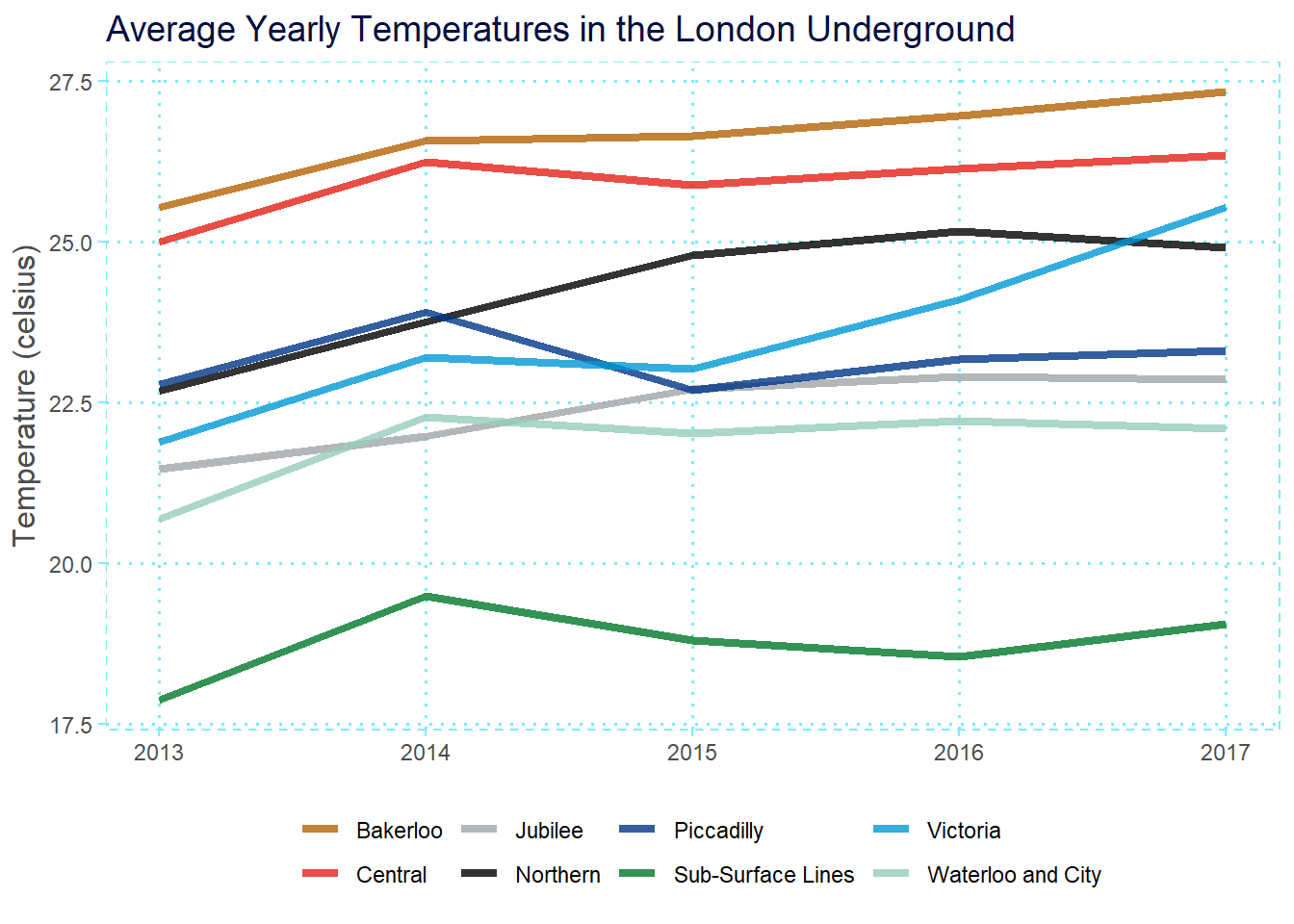
Lastly, if you look carefully, the temperatures seem to be getting slightly hotter each year. We can see this more clearly by averaging temperatures across years:
After having some fun with TfL-themed line plots, I also decided to visualise the data with a heatmap, which I actually think ends up being a better and cleaner choice of visualisation for this data. (The top figure shows data for the entire date range provided in the dataset, and the bottom figure displays data just from 2017-2018 to enable closer comparison between tube lines.)
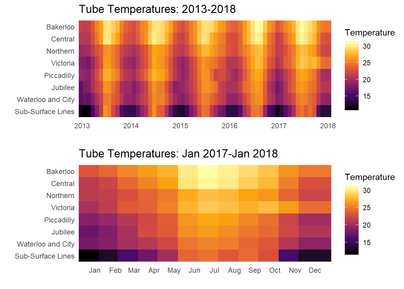
The heatmaps enable us to see the patterns in the data more clearly. For instance, in the bottom figure we can see that while the underground lines increase by roughly 5 degrees from winter to summer, the sub-surface lines increase by around 10 whole degrees!
Modelling Tube Temperatures
Having visualised the data, I immediately wondered how well I could model the large periodicity in temperature, along with the other interesting effects in the data using multiple linear regression.
I started by making a simple additive model with year, month and tube line as my predictor variables.
| temperature | |||
|---|---|---|---|
| Predictors | Estimates | CI | p |
| (Intercept) | -676.98 | -803.75 – -550.21 | <0.001 |
| Year | 0.35 | 0.29 – 0.41 | <0.001 |
| Month [August] | 5.17 | 4.69 – 5.65 | <0.001 |
| Month [December] | -0.79 | -1.27 – -0.31 | 0.001 |
| Month [February] | -2.52 | -2.98 – -2.06 | <0.001 |
| Month [January] | -2.34 | -2.79 – -1.88 | <0.001 |
| Month [July] | 5.37 | 4.90 – 5.85 | <0.001 |
| Month [June] | 3.55 | 3.07 – 4.02 | <0.001 |
| Month [March] | -1.70 | -2.16 – -1.25 | <0.001 |
| Month [May] | 1.56 | 1.10 – 2.02 | <0.001 |
| Month [November] | 0.60 | 0.12 – 1.08 | 0.014 |
| Month [October] | 2.91 | 2.44 – 3.39 | <0.001 |
| Month [September] | 4.37 | 3.89 – 4.85 | <0.001 |
| tube [Central] | -0.77 | -1.16 – -0.38 | <0.001 |
| tube [Jubilee] | -4.19 | -4.58 – -3.79 | <0.001 |
| tube [Northern] | -2.36 | -2.75 – -1.96 | <0.001 |
| tube [Piccadilly] | -3.49 | -3.89 – -3.10 | <0.001 |
| tube [Sub-Surface Lines] | -8.02 | -8.42 – -7.63 | <0.001 |
| tube [Victoria] | -2.88 | -3.27 – -2.49 | <0.001 |
| tube [Waterloo and City] | -4.59 | -4.98 – -4.20 | <0.001 |
| Observations | 520 | ||
| R2 / R2 adjusted | 0.913 / 0.910 | ||
This additive model already turned out pretty well, yielding an adjusted R2 of 0.910.
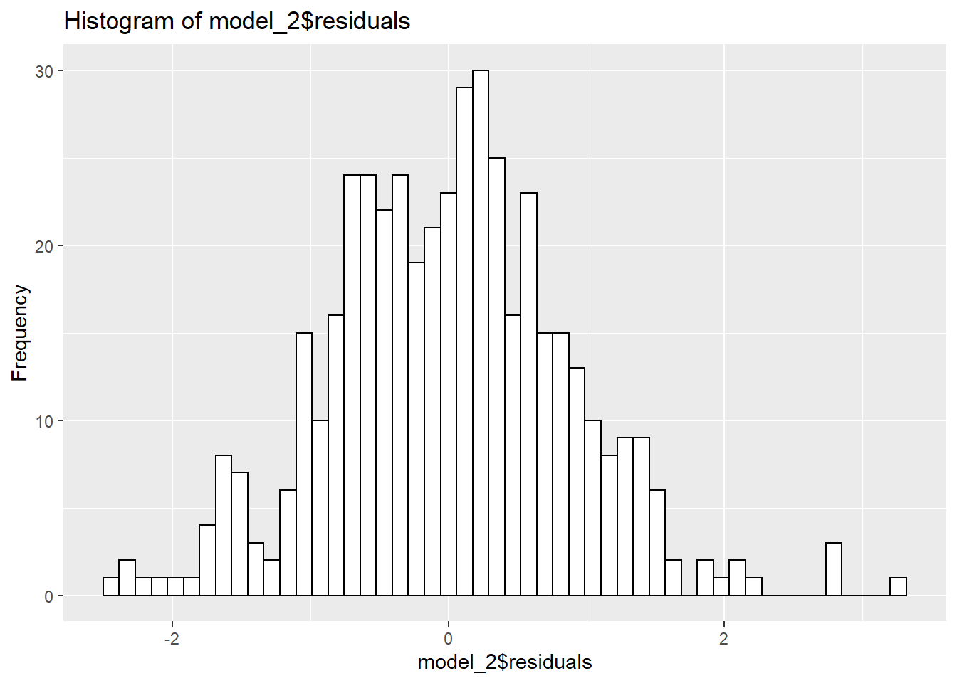
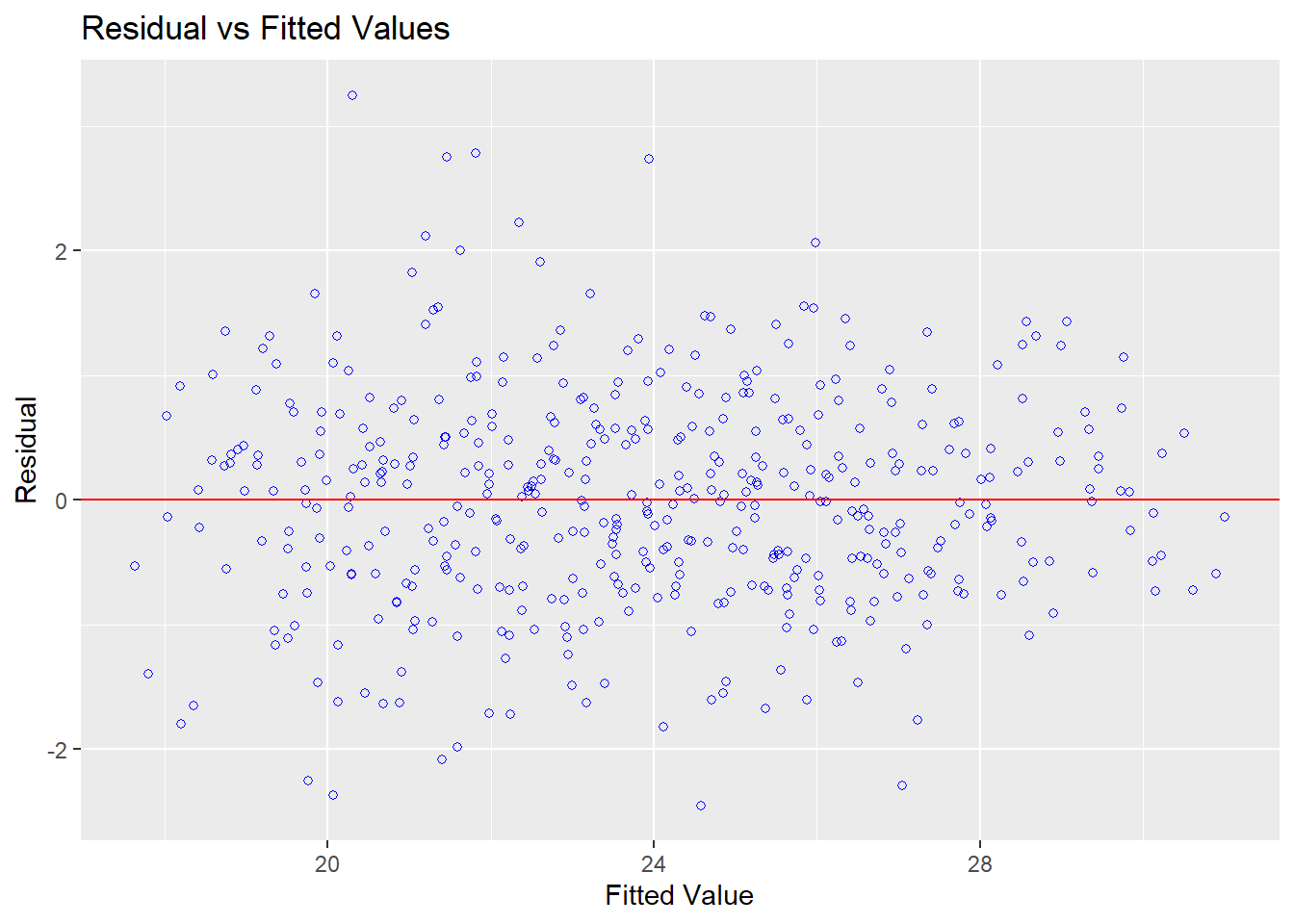
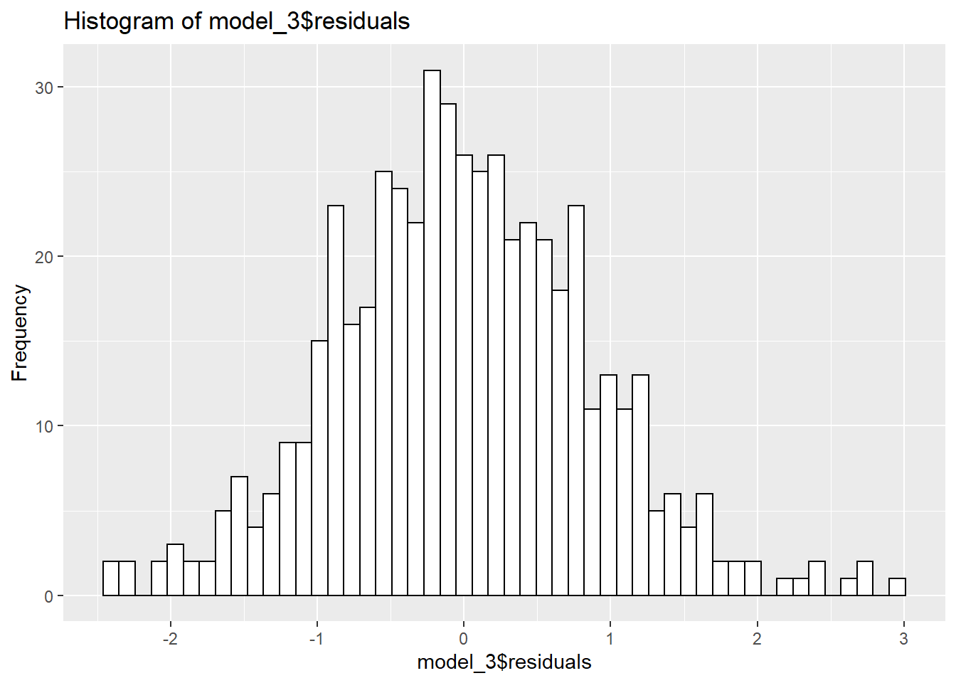
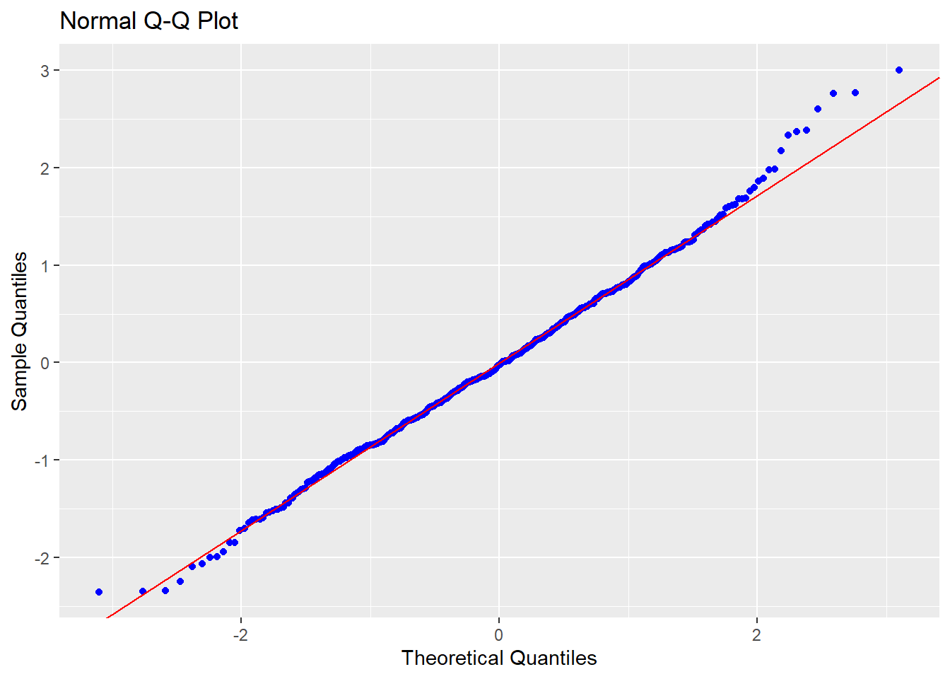
However, problems emerged when I performed diagnostics to check for violations of linearity/normality (for which I used the olsrr package).
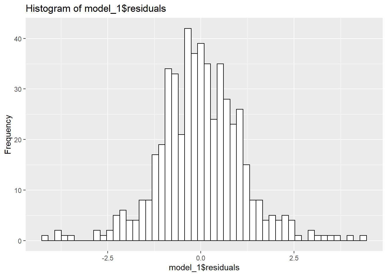
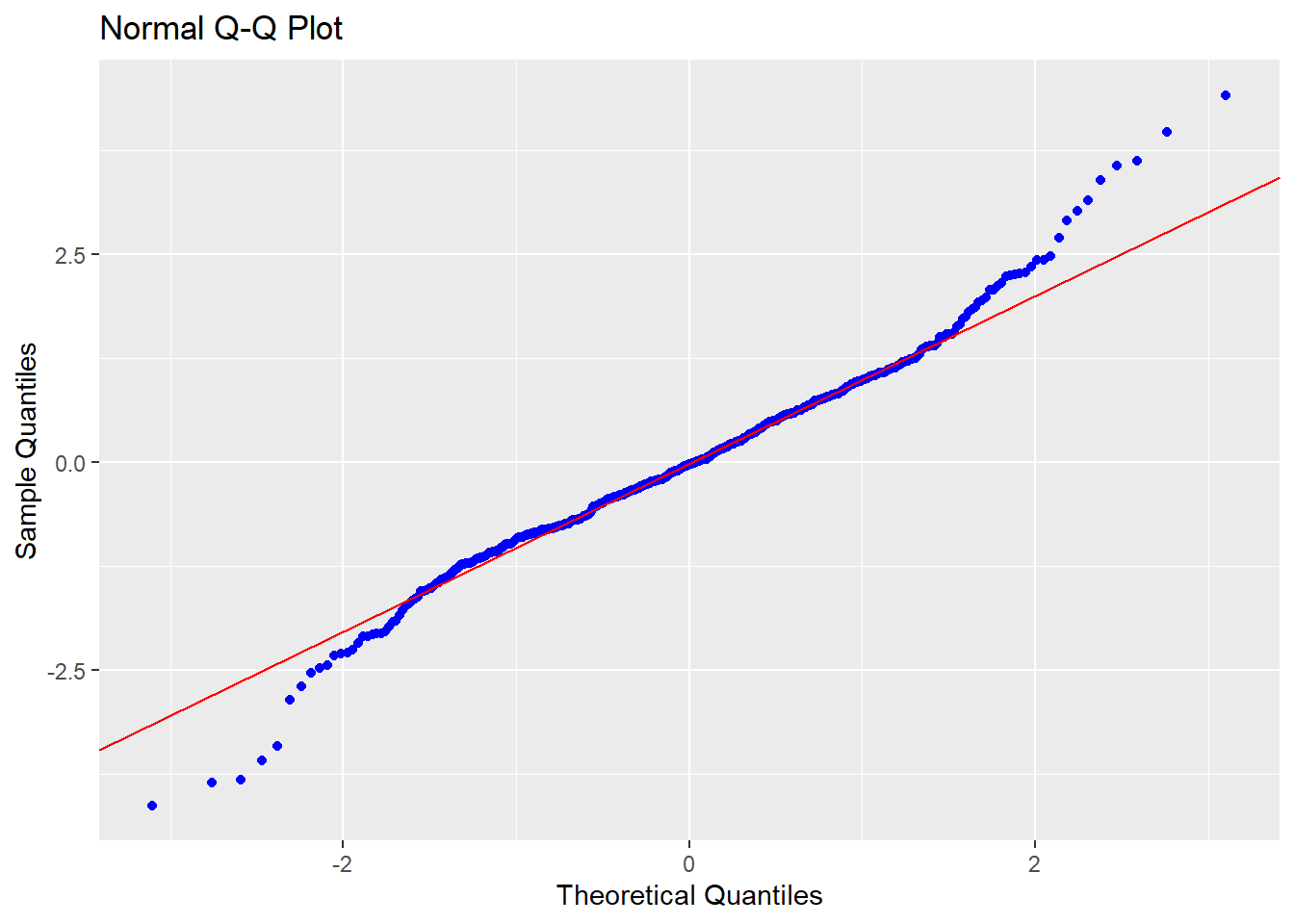
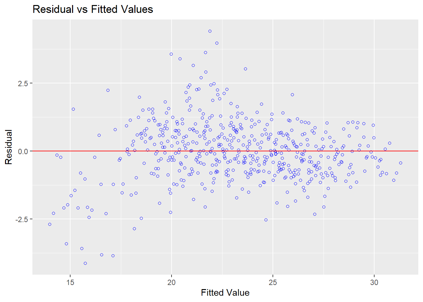
From these plots, there appears to be some non-linearity as well as deviation from normality in the residuals, which is confirmed by tests of normality.
## -----------------------------------------------
##        Test             Statistic       pvalue
## -----------------------------------------------
## Shapiro-Wilk              0.9802         0.0000
## Kolmogorov-Smirnov        0.0481         0.1803
## Cramer-von Mises         38.2508          1e-04
## Anderson-Darling          2.0876         0.0000
## -----------------------------------------------
However, my earlier visualisations gave me some clues into the source of the deviations from normality and linearity; we already saw that the seasonality effect is stronger on sub-surface lines than for other tube lines, suggesting an interaction effect between tube line and month.
To confirm my suspicions, I ran two models.
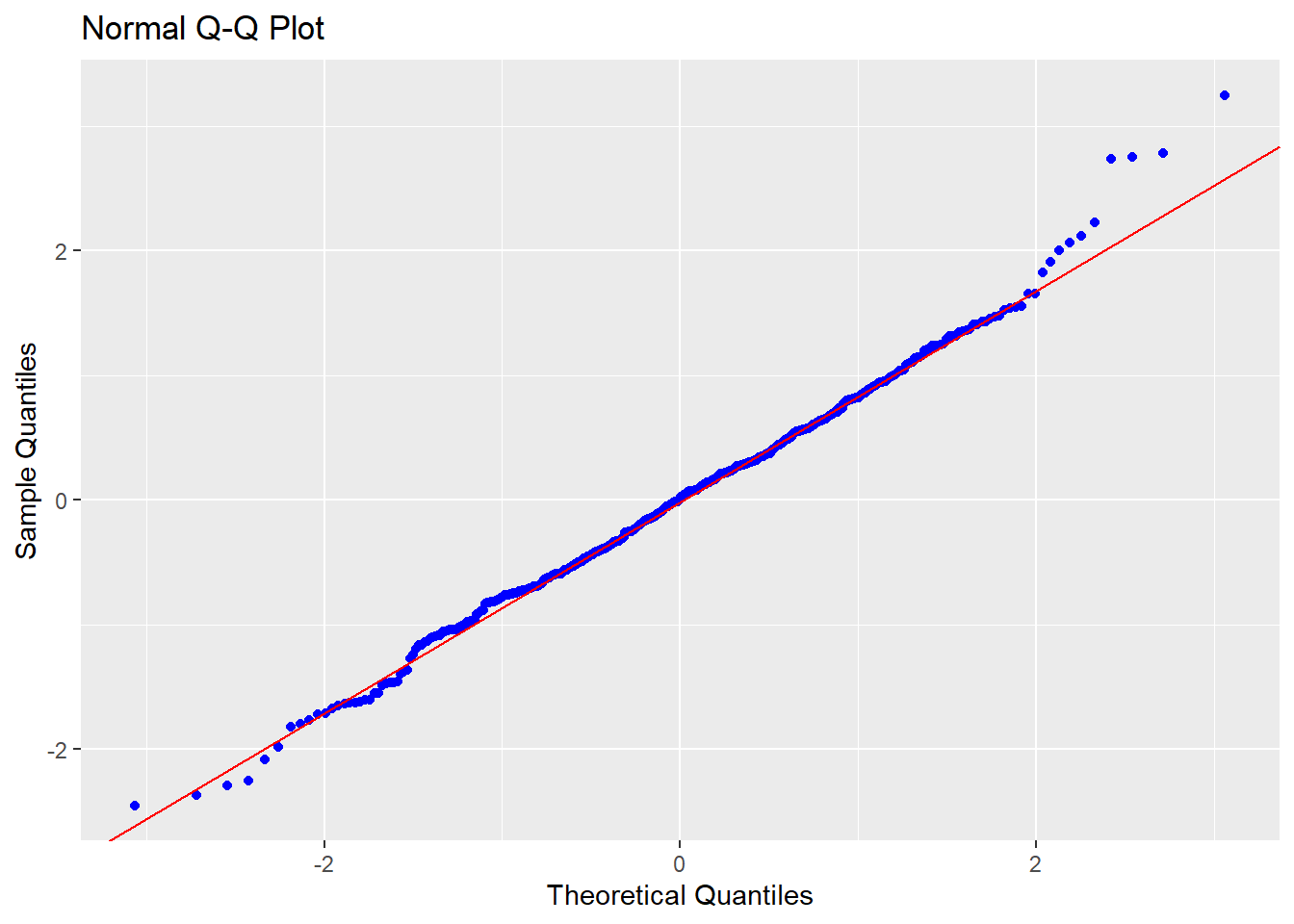
First, I ran a second additive model, excluding the sub-surface lines. This model yields a small improvement in adjusted R2.
| temperature | |||
|---|---|---|---|
| Predictors | Estimates | CI | p |
| (Intercept) | -758.54 | -863.79 – -653.29 | <0.001 |
| Year | 0.39 | 0.34 – 0.44 | <0.001 |
| Month [August] | 4.88 | 4.48 – 5.28 | <0.001 |
| Month [December] | -0.54 | -0.94 – -0.14 | 0.008 |
| Month [February] | -2.24 | -2.62 – -1.86 | <0.001 |
| Month [January] | -2.07 | -2.45 – -1.69 | <0.001 |
| Month [July] | 4.99 | 4.60 – 5.39 | <0.001 |
| Month [June] | 3.27 | 2.87 – 3.66 | <0.001 |
| Month [March] | -1.52 | -1.89 – -1.14 | <0.001 |
| Month [May] | 1.41 | 1.02 – 1.79 | <0.001 |
| Month [November] | 0.80 | 0.40 – 1.20 | <0.001 |
| Month [October] | 2.84 | 2.44 – 3.24 | <0.001 |
| Month [September] | 4.14 | 3.74 – 4.54 | <0.001 |
| tube [Central] | -0.77 | -1.07 – -0.46 | <0.001 |
| tube [Jubilee] | -4.19 | -4.49 – -3.88 | <0.001 |
| tube [Northern] | -2.36 | -2.66 – -2.05 | <0.001 |
| tube [Piccadilly] | -3.49 | -3.80 – -3.19 | <0.001 |
| tube [Victoria] | -2.88 | -3.18 – -2.57 | <0.001 |
| tube [Waterloo and City] | -4.59 | -4.90 – -4.28 | <0.001 |
| Observations | 455 | ||
| R2 / R2 adjusted | 0.923 / 0.920 | ||
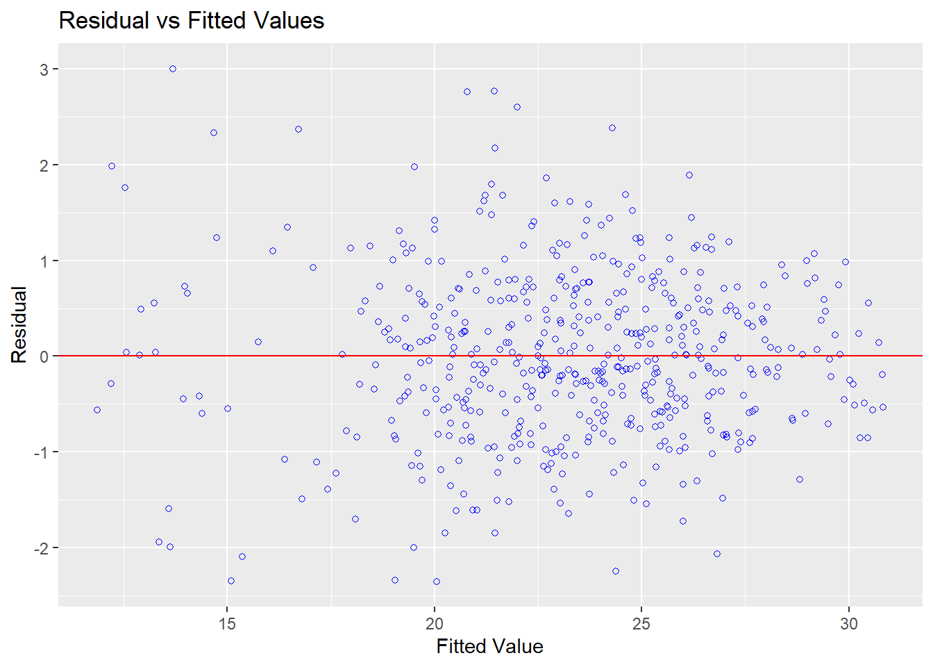
Moreover, the residuals now look to be more normally distributed, and the plot of fitted values vs residuals also looks more promising:
With this model looking promising, I decided to run a third model on the full dataset including an interaction term between month and tube line. Since it gets pretty long, I’ve avoided displaying every single interaction term in the table here, keeping only the important interactions (between sub-surface lines and month).
| temperature | |||
|---|---|---|---|
| Predictors | Estimates | CI | p |
| Year | 0.35 | 0.30 – 0.40 | <0.001 |
| Month [August] | 5.14 | 3.98 – 6.30 | <0.001 |
| Month [December] | -0.01 | -1.17 – 1.15 | 0.991 |
| Month [February] | -1.98 | -3.09 – -0.88 | <0.001 |
| Month [January] | -1.61 | -2.71 – -0.51 | 0.004 |
| Month [July] | 5.04 | 3.88 – 6.20 | <0.001 |
| Month [June] | 3.30 | 2.14 – 4.46 | <0.001 |
| Month [March] | -1.47 | -2.57 – -0.37 | 0.009 |
| Month [May] | 1.45 | 0.29 – 2.61 | 0.014 |
| Month [November] | 1.38 | 0.22 – 2.53 | 0.020 |
| Month [October] | 3.27 | 2.11 – 4.43 | <0.001 |
| Month [September] | 4.59 | 3.43 – 5.75 | <0.001 |
| tube [Central] | -0.59 | -1.69 – 0.52 | 0.296 |
| tube [Jubilee] | -3.54 | -4.64 – -2.43 | <0.001 |
| tube [Northern] | -1.96 | -3.07 – -0.86 | 0.001 |
| tube [Piccadilly] | -3.42 | -4.52 – -2.31 | <0.001 |
| tube [Sub-Surface Lines] | -7.91 | -9.02 – -6.81 | <0.001 |
| tube [Victoria] | -2.84 | -3.94 – -1.73 | <0.001 |
| tube [Waterloo and City] | -4.04 | -5.14 – -2.93 | <0.001 |
|
Month [August] * tube [Sub-Surface Lines] |
2.20 | 0.56 – 3.83 | 0.009 |
|
Month [December] * tube [Sub-Surface Lines] |
-2.40 | -4.04 – -0.76 | 0.004 |
|
Month [February] * tube [Sub-Surface Lines] |
-2.53 | -4.09 – -0.97 | 0.002 |
|
Month [January] * tube [Sub-Surface Lines] |
-2.58 | -4.14 – -1.02 | 0.001 |
|
Month [July] * tube [Sub-Surface Lines] |
3.20 | 1.56 – 4.83 | <0.001 |
|
Month [June] * tube [Sub-Surface Lines] |
2.37 | 0.73 – 4.00 | 0.005 |
|
Month [March] * tube [Sub-Surface Lines] |
-1.56 | -3.12 – 0.00 | 0.050 |
|
Month [May] * tube [Sub-Surface Lines] |
1.15 | -0.45 – 2.75 | 0.160 |
|
Month [November] * tube [Sub-Surface Lines] |
-2.00 | -3.64 – -0.36 | 0.017 |
|
Month [October] * tube [Sub-Surface Lines] |
0.34 | -1.30 – 1.97 | 0.688 |
|
Month [September] * tube [Sub-Surface Lines] |
1.58 | -0.06 – 3.22 | 0.059 |
| Observations | 520 | ||
| R2 / R2 adjusted | 0.946 / 0.934 | ||
This model yields an even better fit (adjusted R2 = 0.934).
The diagnostic tests also appear more promising for this model (although residuals are still not perfectly normal):
## -----------------------------------------------
##        Test             Statistic       pvalue
## -----------------------------------------------
## Shapiro-Wilk              0.9954         0.1287
## Kolmogorov-Smirnov        0.0232         0.9413
## Cramer-von Mises         41.4997          1e-04
## Anderson-Darling          0.3615         0.4438
## -----------------------------------------------
I should note, however, that although interesting to explore the interaction effect, the small gain in adjusted R2 may not really be worth the increased complexity of adding the term in!
Further Exploration: Passenger Numbers
Now, the models above achieve a pretty good fit using just three variables; year, month and tube line. But, what exactly does the variable “tube line” represent here? For instance, what is it about the Central line that makes it hotter than the Jubilee?
One possible difference might be in the number of passengers on each line, with more passengers leading to hotter temperatures. On the otherhand, the differences in temperatures across tube lines could also be driven by structural differences between the lines, such as:
- how deep below the ground the tube lines run
- what % of the tube journey is made underground
- differences in the materials used to build the tunnels
I was unable to find a lot of this data. But, I was able to find some data on passenger numbers from TfL.
The data gives the number of passengers (in millions) at each station between 2010-2017. Sadly, I couldn’t find data broken down by month so I had to make do with yearly passenger numbers.
Since the data was broken down by station rather than tube line, I also had to do some work to match up the stations to the tube lines (I’ve put the scraping and cleaning code on github in my tube-temps project).
So, to what extent does passenger number influence tube temperature? Let’s take a look.
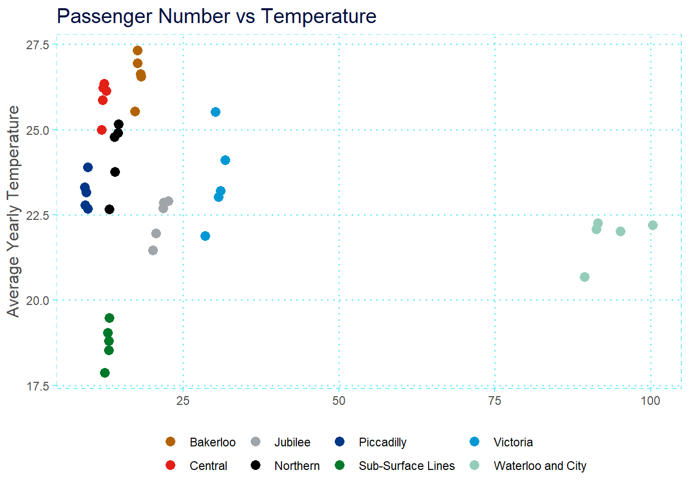
Well… not much. There is a small effect of passenger number within each tube line, but it certainly doesn’t seem to account for the differences in temperatures across tube lines.
With no access to further tube-related variables I had to end my journey here. However, even with the data I do have, I think there’s sufficient evidence to conclude that differences in temperatures across tube lines are probably driven by structural differences rather than passenger numbers.